Your entryway sets the tone for your entire home, but it's one of the most overlooked spaces when it comes to design. Common entryway decorating mistakes make your guests feel overwhelmed or unwelcome. From furniture that's the wrong scale to lighting that casts unflattering shadows, these errors are easy to make but just as easy to fix. These issues exist in grand entrance halls or small, narrow hallways. But no matter the dimensions or architectural limitations, you can create an entryway that sets guests at ease. Here's how to avoid entryway decorating mistakes so that your home is always welcoming.
Entryway Furniture That's the Wrong Scale
One of the worst entryway decorating mistakes is choosing a console table or bench that's too small for the space. In a narrow entryway, an undersized table doesn't provide enough space for keys, mail, or decorative items. Meanwhile, in a larger foyer, small furniture makes the space feel empty and unwelcoming.
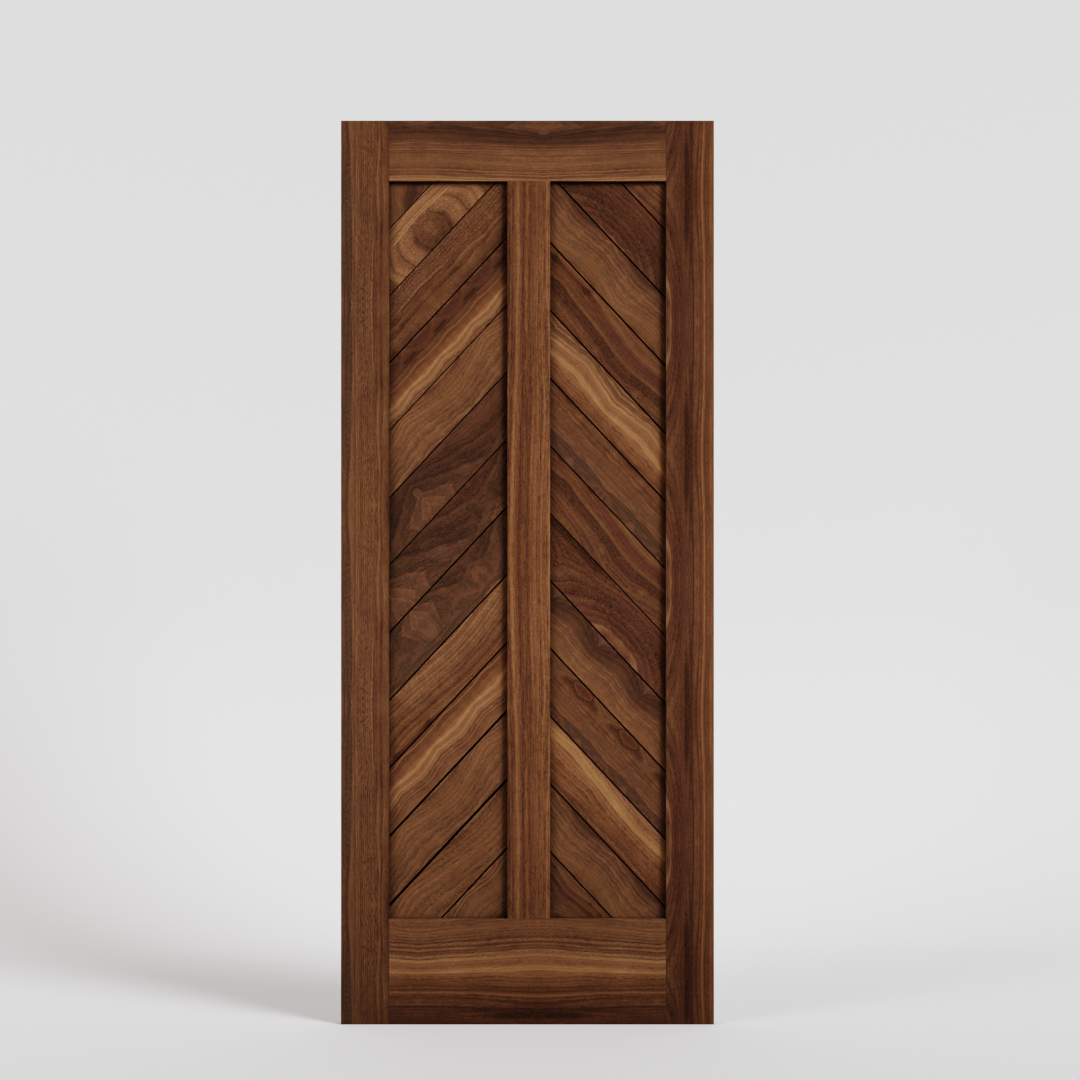
If you have a narrow entryway (3-4 feet wide), consider a slim bench with storage underneath. Pair your console with a mirror that's proportional in scale, or roughly two-thirds the width of the table itself. The right wood front door design establishes the scale for the rest of your entryway elements, so start there if you're replacing your door.
Inadequate Entryway Lighting
Bad lighting is among the most common entryway decor mistakes. A single overhead fixture can create harsh shadows on faces, making your entrance feel uninviting. On the other hand, too-dim lighting makes it difficult to tie your shoes or check the mirror.
As with most areas of the home, the solution is to use multiple light sources. This is the secret to creating warm, flattering light. Combine an overhead fixture with a table lamp, wall sconces, or even a floor lamp tucked in the corner. For pendant lights over a console table, hang them 30-32 inches above the surface but not higher. In entryways with high ceilings, add a statement chandelier, with task lighting at eye level.
No Designated Landing Zone for Daily Essentials

Without a clear spot for keys, mail, shoes, and bags, your entryway becomes a dumping ground. This entryway decorating mistake looks messy, fast. And it makes it harder to find what you need when you're heading out the door.
Instead, create "drop zones" within your entryway. Use a catchall tray or dish for keys and small items, wall hooks for coats and bags, and a shoe cabinet or basket to hide footwear. (Open shoe racks never end up looking that nice and we recommend avoiding them if you can.) Trays and baskets group the items that tend to pile up by the door. So they don't eliminate clutter, but they organize it.
Treating Your Front Door Like an Afterthought
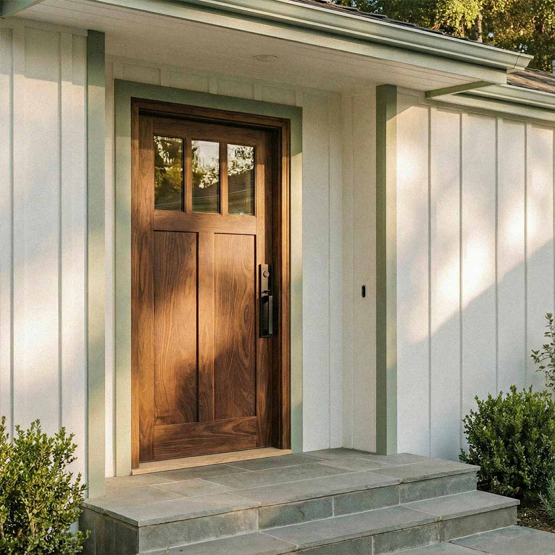
Your front door is the focal point of your entryway, yet many homeowners end up with a basic builder-grade door that does nothing for their home's design. This mistake is especially problematic from the outside, where your door creates the first impression for guests.
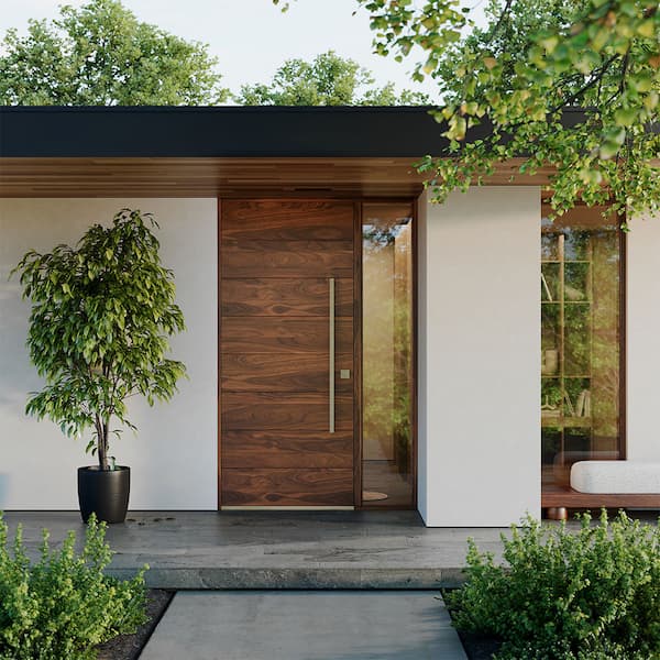
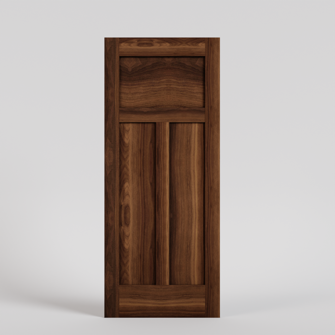
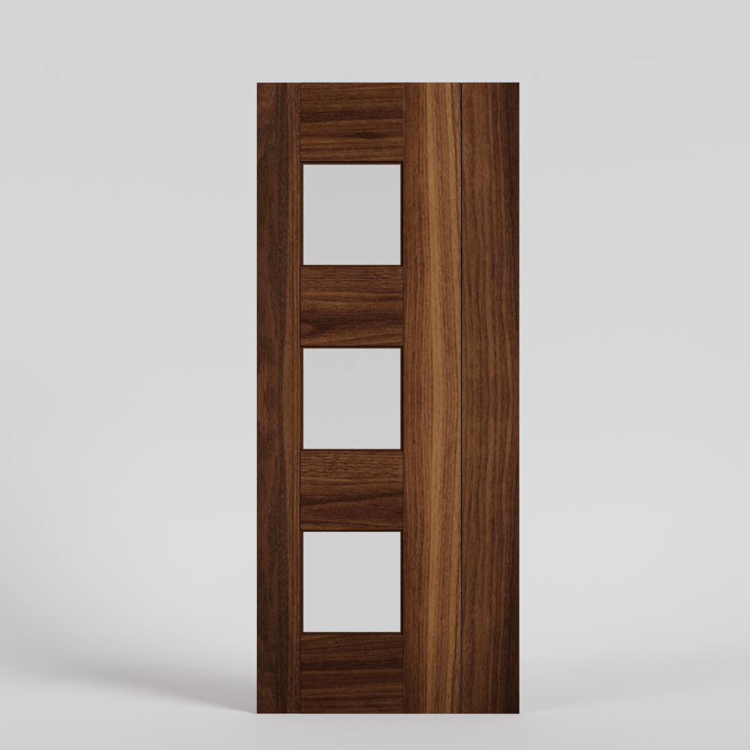
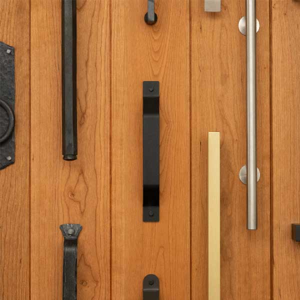
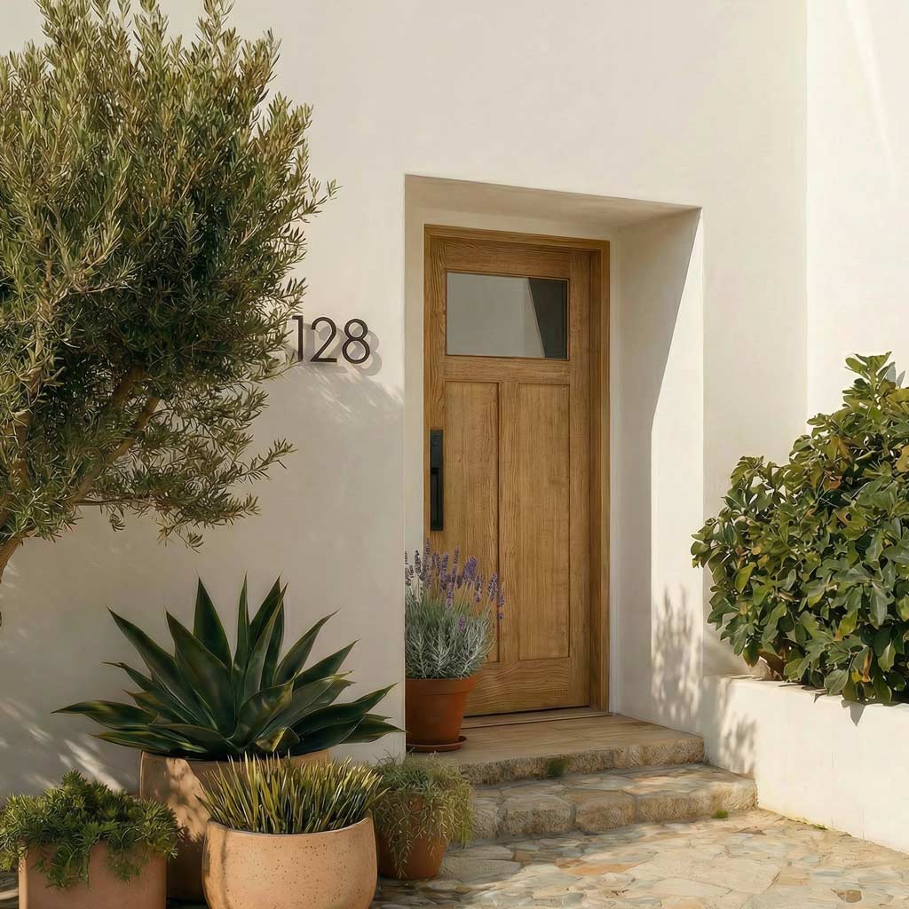
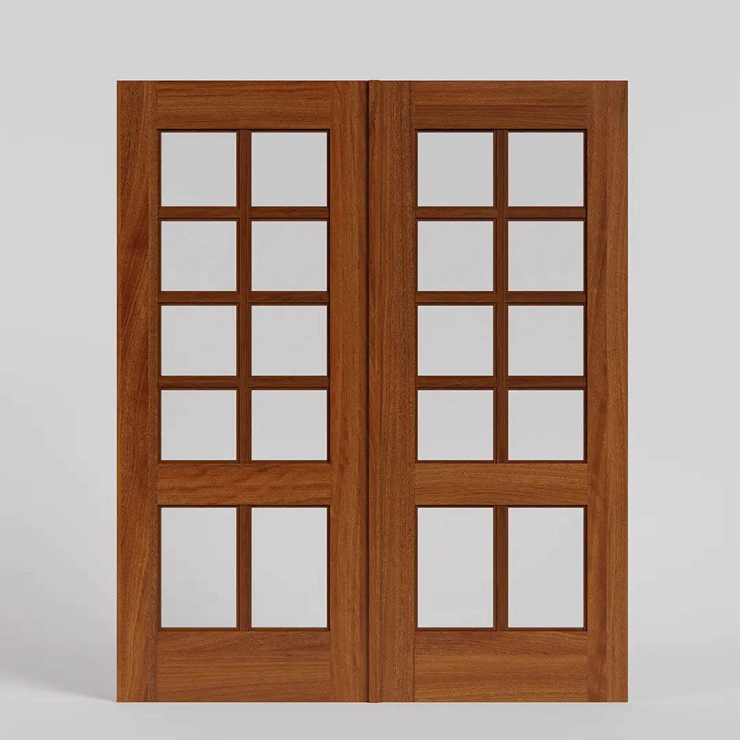
Invest in a door that reflects your home's style. Traditional wood front doors work beautifully on Colonial and Craftsman homes, while modern entry doors with clean lines and glass panels complement contemporary architecture. Don't forget hardware—quality handle sets and hinges complete the look. Your door is one of the most important design elements of your home, so it's worth putting thought into your chosen design.
Artwork and Mirrors Placed Too High
Walk into most entryways and you'll see artwork mounted several inches too high. This entryway decor mistake impacts a first impression in ways that are subtle but powerful. It just makes a space feel off-kilter and out of proportion.

Hang artwork and mirrors so the center sits at eye level, typically 57-60 inches from the floor. In entryways, a large mirror above a console table should have its bottom edge 4-6 inches above the table surface. Have someone stand back while you position pieces before committing to nail holes. Don't try to hang pictures by yourself--you'll have a hard time assessing placement without a second pair of eyes. It's worth hiring a Taskrabbit or handyman for help hanging pictures in your entryway if you live alone.
Blocking Natural Light
Heavy curtains, dark paint colors, or furniture placed in front of windows can turn your entryway into a cave. This mistake is particularly problematic if your entry has limited square footage.
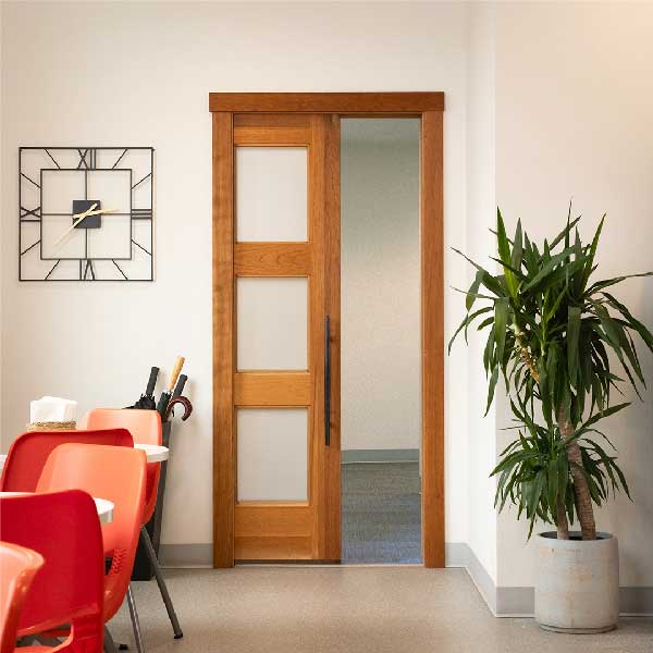
Maximize whatever natural light you have. If your door has glass panels, keep window treatments minimal or skip them entirely for privacy glass. Paint walls in light, reflective colors. Position your console table away from windows when possible, and choose a mirror to bounce light around the space. For entryways with sidelights, resist the urge to cover them completely—let that light in.
Too Much or Too Little Contrast
Entryways that blend into one neutral mass feel bland and forgettable. The opposite extreme—too many competing colors and patterns—creates visual clutter. Both are common entryway decorating mistakes that miss the mark.

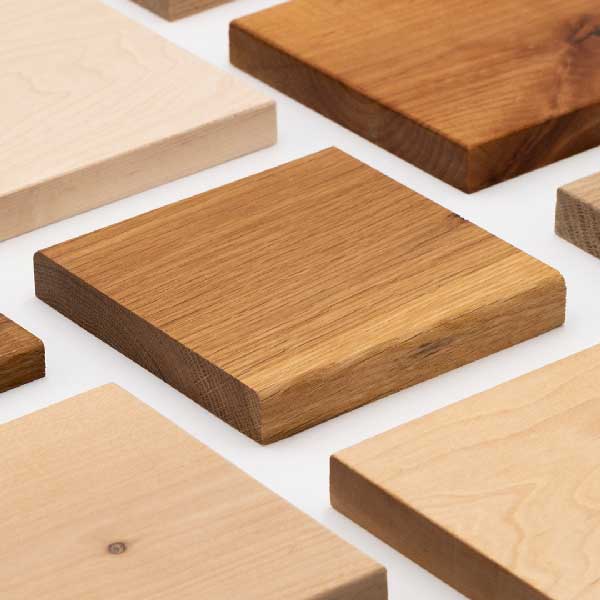
Aim for a balanced color palette with one or two accent colors. If your walls are neutral, add color through your rug, artwork, or decorative objects on the console. Don't be afraid to paint trim or your front door in a contrasting shade. Your wood species and finish choice for a new door provides an opportunity to introduce warmth—a rich walnut or cherry door stands out against light walls without overwhelming the space.
Ignoring Floor Decor
Bare floor can feel impersonal when a guest first enters your house. An area rug for your entryway solves this problem, and also makes the space feel more intentional. Area rugs delineate spatial boundaries and zones. For a high-traffic spot like an entryway, look for a low-pile rug that's easy to clean.
All Furniture Pushed Against The Walls
In an effort to maximize floor space, many people push all entryway furniture flush against the wall. In fact, this mistake is seen throughout the home. It's an understandable impulse if you live in a smaller house. But when everything is pushed up against the wall it paradoxically makes a room feel smaller.

Float your console table a few inches from the wall if you have the space. This creates depth. You can tuck a basket underneath for more storage. In larger foyers, place a bench or create a small seating vignette where people can put their shoes on and off.
Matching Furniture Sets That Feel Generic
Buying an entryway "set" from the same collection might seem like the safe choice, but it's one of those entryway decor mistakes that makes your space feel like a showroom instead of a home.
It's always best to mix your furniture and decor sources. Pair a vintage mirror with a new console table. Combine metal hooks with a wooden bench. Layer in personal items—framed photos, a bowl from your travels, or artwork that means something to you. Your entryway should tell visitors who you are--don't worry about creating a "perfectly" styled first impression.
Avoiding These Entryway Decorating Mistakes Transforms Your Home's First Impression
Your entryway deserves the same attention you give to other rooms in your home. By avoiding these common entryway decorating mistakes, you create a space that's both functional and welcoming. The right combination of properly scaled furniture, layered lighting, smart storage, and thoughtful design details makes your entrance work harder and look better.
Start with the foundation—your front door. Explore our collection of handcrafted wood entry doors designed to make a lasting first impression. From traditional to modern styles, every door is built with solid wood and traditional joinery for beauty that lasts.









Leave a comment (all fields required)